Legion TD 2 - Rebranding (Logo and Logotype)
As we were discussing the Launch Date for the game (2021 October), I was strong on the idea that we had to rebrand our game's logo and logotype. I had no more excuse to postpone this task and I dove into this task, which was new to me and also difficult. I learn so much from this task.
(c) AutoAttack Games 2020

Results first!
When I first joined, I didn't have any bandwidth to work on Rebranding/logo. But as the launch date approached we figured it was time. I made three different Logotypes and Launcher icon updates.

The launcher logo before and after. We were just using Sky King's illustration face crop for the game launcher and you couldn't tell what you are looking at, and square silhouette icons are too common.

I don't have much experience in this so I was ready to go try bold and wild.

I only used black and white bc it should work well in just two values. I tried getting inspo from the game genere, name, letters, you name it.

But I felt like I was so lost. Tower was from "tower defense genre" but def felt outdated and too medieval, and other abstract shapes of chess/boardgame or letters seemed to be too confusing.

Suddenly I added 3 and 4, which were resembling Sky King's head and Earth King's head. And knowing Earth King background was about to be released along the launch, I felt like it could be a good connection.

You can see I'm still not letting go of the tower idea...

and trying to eliminate the number "2" somehow.... (spoiler: I coudln't)

Narrowed down to two finally!

then becomes three...

Then six variations... -_-
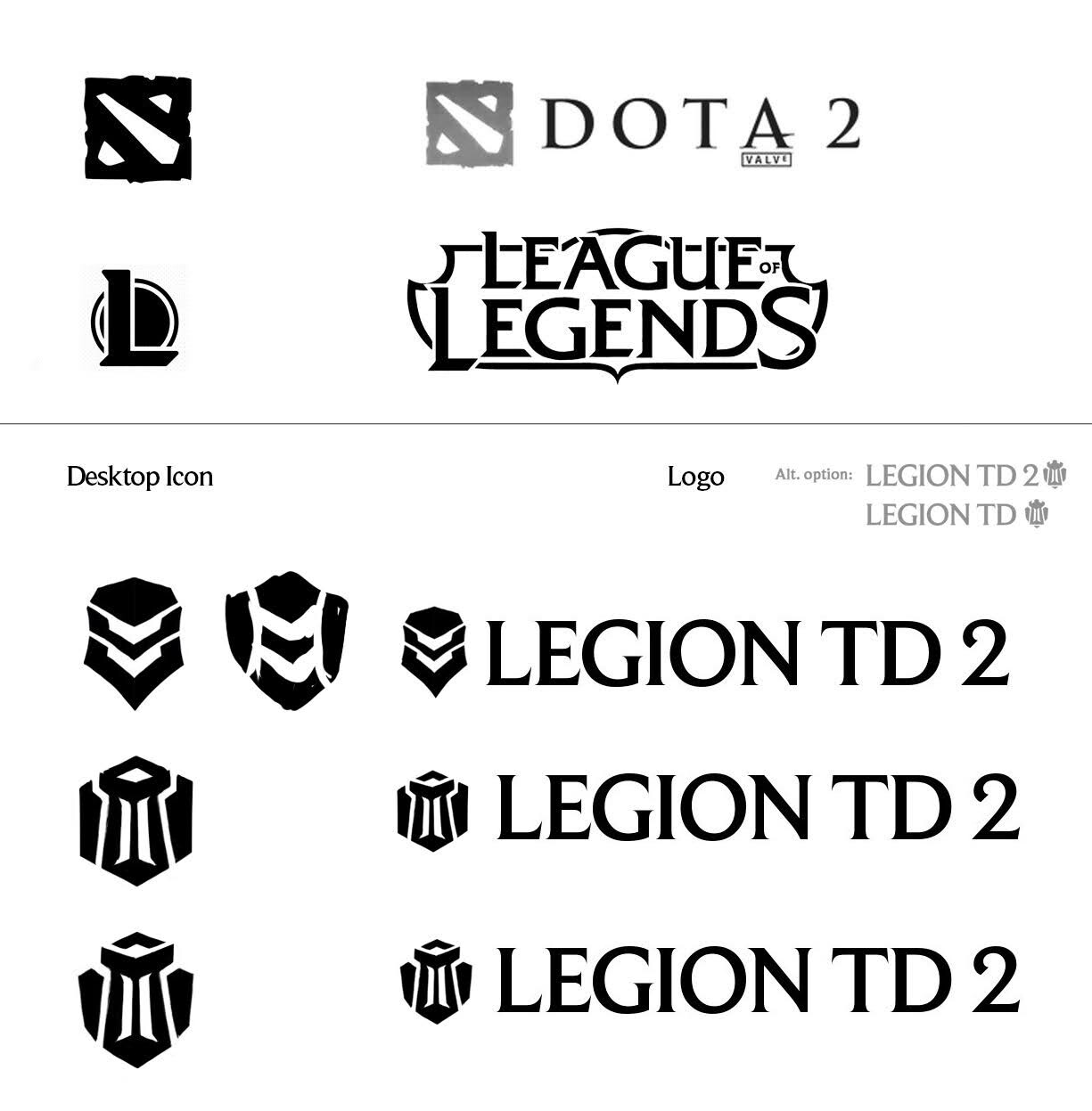
and back to three!

Then another expansion. F and G was a new idea tyring to visualize the lanes but it resembled the alphabet "Y" too much. We went with A for its simplicity and liked the downward arrow shapes since our game has enemies walking down toward you.

Now that we had a logo, we needed a new logotype. I explored a bunch of fonts that were futuristic and Sci-Fi, since our whole client is slightly in teal color theme with techy SFX and design overall. No more medieval fonts.

I tried so many fonts but couldn't find one I liked so this is when I started drawing my own font. I also know that we will need a vertical one for vertical banners too so I got started on it. Hexagon comes from the aura unit formation of the gameplay.

I just needed to clean up the handmade font now and make sure it's easily read.

Every detail was considered.

While this was happening, I also had to make a Chinese logo bc someone took and copyrighted our actual game name already :( In China, brand copyrights are first-come-first-serve and our original mod was doing still well. I also had to draw this font.